The Importance of Colour Management in Photographic Printing
In a recent feature on Georges CamerasTV, Karima Asaad, celebrated for her emotive and genuine photography and vision for directing in Sydney and the US, teamed up with Melbourne's Ian van der Wolde to delve into the subtleties of colour management and photographic printing.
During the in-depth one-on-one workshop session, Ian translates the technicalities of printing and explains the techniques and devices to use in order to achieve perfect colour.
Why Printing is Amazing and Should Be Done More Often
One cannot underestimate the tactile experience of holding a photograph, of feeling its weight and texture, a far cry from merely swiping through digital images on a screen. It brings a new dimension to the artwork, making it more palpable and immediate. When Karima Razaad asserts that printing transforms a picture into a piece of art, she touches on this deeper, almost 'darkroom-like' process that elevates an image from the transient to the eternal.
Moreover, a printed photograph opens up an avenue for artistic interpretation that extends beyond what a digital screen can offer. Paper quality, ink types, and printing techniques contribute to the result, allowing photographers to add unique layers of depth and nuance to their work. The characteristics of various printing papers - from handmade Japanese papers to types that evoke nostalgic emotions enrich the outcome, imbuing it with added layers of artistic intent and meaning.
Then, there is the commercial angle to consider, as noted by Ian. Even for those who primarily view photography as art, the option to diversify income streams by selling fine art prints is compelling to pursue as a business. This makes financial sense and broadens the audience for one's work.

What Is Colour Management and Colour Accuracy?
Colour management and colour accuracy are important aspects of a photographer's workflow. Essentially, they dictate how accurate colours are rendered across different devices and mediums. At the heart of this complex process are concepts like colour gamut, colour space, and the influence of lighting, which all determine the fidelity of the final output, whether viewed on a screen or printed on paper.

What is Colour Gamut?
Colour Gamut is a strange word and something many photographers fear. Its basic explanation refers to the range of colours a device, such as a monitor or printer, can show or reproduce. Different devices have varying colour gamuts, meaning that some may be able to display a wider array of colours than others, hence why you pay more.

What is a Colour Space?
Colour Space is a specific range of colours that can be represented. Common colour spaces in digital photography include sRGB, Adobe RGB, and ProPhoto RGB, each with advantages and limitations. The file format you shoot in will impact how the colours in a digital image will appear on various devices and how they will print. We recommend shooting in a RAW file format for all cases, as you can change the file's colour space in post-processing.

Lighting Conditions and How They Alter Colour
Lighting conditions significantly influence the perception of colour. Even the most meticulously calibrated screen or finely tuned print can appear different under diverse lighting conditions. Whether viewing a photo on a backlit LCD screen in broad daylight or observing a print in a dimly lit room, the ambient light will affect the colours you see.
Why Pictures Looks Different From The Camera, Monitor To Print
One common challenge photographers face is the discrepancy in colour between the camera's LCD screen, a computer monitor, and the final printed photograph. A shot may look perfect on the camera's backlit LCD but may appear washed out or overly saturated when transferred to a computer.
Finally, when the image is printed, it may seem entirely different, often because printers have a different colour gamut than screens. These inconsistencies can be frustrating and misleading, and they occur primarily because each device handles colours uniquely, within its limitations of colour space and gamut.

How To Fix The Issue and By Profiling Your Devices
The key to resolving these discrepancies lies in proper colour profiling, a part of the broader field of colour management. Profiling involves creating a set of data that describes how a particular device reproduces colour, or as Ian puts it, "We're not actually calibrating the printer; we're assessing how a specific type of paper interacts with the ink."
How To Profile a Monitor To Show Correct Colour
Ian speaks highly of BenQ's SW Photographers Monitors, particularly the BenQ SW272U, designed for precise hardware calibration.
"These monitors are hardware calibrated, and it's specifically designed for photographers to display the colours that our cameras capture." - Ian van der Wolde.
Though the monitor may function okay with its default settings, tailoring a unique profile to match your specific workspace conditions is recommended for best performance. Instead of depending solely on visual estimation for fine-tuning hues, luminance, and saturation, employing a Calibrite ColorChecker Studio device is recommended.

The Calibrite ColorChecker Studio is a professional-grade calibration device powered by X-rite technology. It serves multiple purposes, including monitor calibration, printing and camera profiling, and scanner calibration. Its primary role is to create a colour profile that ensures the colours displayed on your monitor closely match the original colours captured by your camera or those you intend to print.
The setup of the device is very straightforward. All that's required is to download and initiate the software. Then select the type of monitor you are using and the backlight tech if prompted. The company recommends turning the monitor on for at least half an hour before attempting to profile to stabilise the display properties.
Attaching the device to your monitor is easy. The device should lay flat against the screen before following the software prompts to begin the profiling process. After calibration, the software will create a colour profile tailored to your monitor. Save this profile and set it as the default for your operating system's colour management system.

Printer Profiling and Setting an ICC Profile For Your Paper
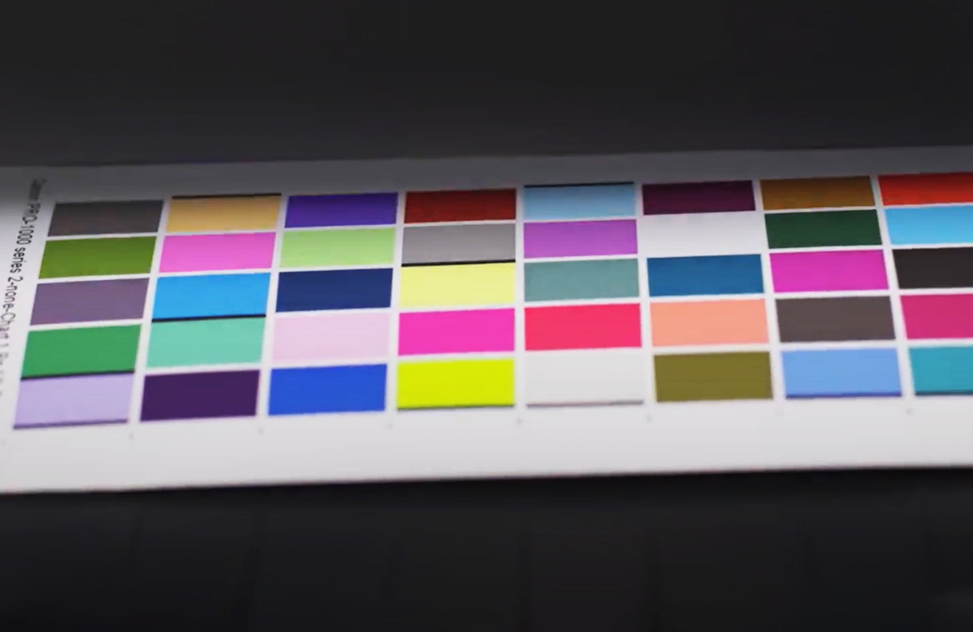
In a printing workflow, a significant aspect often misunderstood is printer profiling. Ian explains, "We're not actually calibrating the printer; we're assessing how a specific type of paper interacts with the ink." For his setup, Ian recommends using the Canon Image Prograf Pro1000 A2 printer for its large colour gamut and archival quality, made possible by its 10-pigment inks.
We recommend using the Calibrate ColorChecker Studio again to achieve optimal colour accuracy and quality when using the Canon Pro 1000 printer with Ilford paper. Start by installing the Calibrite software if you haven't already done so, and initiate the application. Before delving into the calibration process, ensure the Canon Pro 1000 printer is loaded with your selected Ilford paper and set to the corresponding print settings.
The software will then instruct you to print a series of colour patches to evaluate the ink-paper interaction. Once printed and sufficiently dried, scan these patches using the Calibrite ColorChecker Studio device. This will record the true colours produced by your unique printer-paper pairing.
The software will generate a custom International Colour Consortium (ICC) profile with the scan complete. Save this to a location accessible by your computer's colour management system.
The next phase involves applying this new ICC profile within your image editing software, such as Adobe Photoshop, to ensure accurate colour replication in your final prints. After assignment, conduct a test print to validate the profile's efficacy by comparing it against your also-calibrated monitor.

Our favourite Ilford Paper For Printing Photos
Recommendations for Viewing Your Prints
The concluding phase in the colour management procedure involves examining your images under a light source that is also colour-managed. For this purpose, it's essential to use an industry-standard viewing lamp. Ian recommends the Ilford Ilfocus Color Viewing Lamp, which offers touch-controlled colour temperature settings ranging from 3000K for tungsten-balanced light, 4000K for a middle warm light, 5000K and 6500K for daylight-balanced light.

Final Thoughts
While the initial setup process may be daunting, we recommend spending time with an expert like Ian, who can walk you through the complete colour management system from shooting to print. During the workshop, you'll also experience the Canon Image Prograf Pro1000 A2 printer and a range of Ilford papers designed for high-end printing.
"Attendees at our workshop will learn that printing at home is not as challenging as they might think" - Ian van der Wolde.
For more information on upcoming workshops and to deepen your knowledge of photographic printing, check out our current events here.